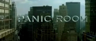
In the Panic Room opening sequence, the credits appear almost to infiltrate their surroundings. For example, here Jared Leto's name is only just visible against the background that it blends in with.

The names also stay static on the screen, so they do not move from the position we originally see them in, as if the image was a still. However, we know it is not as here for example we can see the traffic moving in the bottom left hand corner.
The names themselves are positioned for the most part in the centre of the screen, with some being revealed as the camera pans and some being wholly visible straight away.
Interestingly, the title of the film appears in the same font as the credits, and is positioned in the middle of the title sequence, in amongst the credits. As the title appears, the music changes to become more fast paced and threatening. A noise that is similar to that of a ticking clock is also introduced which creates the impression that time could be important in the film in the sense that it could be running out for one of the characters.
The Girl With The Dragon Tattoo
The sequence starts with a series of flashing clips and a fast paced intro on the soundtrack. The credits last for longer than the flashing clips, allowing us as the viewer more time to read them, though not distracting from the nature of the opening. The beginning clips are very closely cut together, about one cut every second, which creates a sense of distortion at first, though as the opening continues the things in the clips are slowly revealed further.
 The name of the film appears after the names of people we would assume to be the male and female lead. The font is similarly coloured to the rest of the opening so far - grey and black, which creates quite a sinister mood.
The title is then engulfed by what appears to be water, almost as quickly as it appeared to begin with.
 The credits appear in a different font altogether, and are in white so contrast well with the background. They mostly appear off-centred and over a 'dead' part of the frame where nothing is happening to draw your attention to.
 The opening for this film starts with a short scene with two characters who we assume will be important in the film, before the credits themselves begin.

This scene lasts for just under fifteen seconds. The last frame of the scene is held as the soundtrack starts to play, before the screen cuts to black.
The title of the film pans in from the bottom of the screen before being positioned in the centre of the screen. The font is bold and colourful, which seems to link with the upbeat soundtrack that is playing over the top. The title stays here for about a second, before it slowly starts shrinking backwards for credits to appear over the top.
The credits stay central for over half of the opening, before they start to appear grouped. When this occurs, they appear like the title did in the beginning, simply rising upwards from the bottom of the screen.


No comments:
Post a Comment