Wednesday 28 March 2012

Rough Cut, Final Opening Comparision - Shot/Reverse Shots - Chris

Final Version
Rough Cut Version


The two images above are both the same section of the shot/reverse shot sequence, with one being from the rough cut and the other coming from the final version of the opening. The first thing that is immediately noticeable is the difference in the framing of each of the shots. In the rough cut version, there has been a lot of empty space left around the subject. This left the viewer's eye able to wander around the space and put little emphasis on the subject of the shot. Getting rid of the blank space has also given the impression that the frame has been zoomed in a lot more than originally. This makes the subject easier to see and to see their body language and reactions. It also makes it easier to distinguish who the viewer is meant to be concentrating on in the frame. Along with this, the person who's shoulder we are looking over has been drastically been reduced in size and impact on the frame. This also helps focus attention on the intended subject as the viewer cannot see this person very well, and it looks more like we aren't meant to see them. Overall, the re-shot shot/reverse shots have vastly improved the quality of framing during the sequence.

Monday 26 March 2012

Title Analysis - Megan

Panic Room


In the Panic Room opening sequence, the credits appear almost to infiltrate their surroundings. For example, here Jared Leto's name is only just visible against the background that it blends in with.


The names also stay static on the screen, so they do not move from the position we originally see them in, as if the image was a still. However, we know it is not as here for example we can see the traffic moving in the bottom left hand corner.
The names themselves are positioned for the most part in the centre of the screen, with some being revealed as the camera pans and some being wholly visible straight away.
 Interestingly, the title of the film appears in the same font as the credits, and is positioned in the middle of the title sequence, in amongst the credits. As the title appears, the music changes to become more fast paced and threatening. A noise that is similar to that of a ticking clock is also introduced which creates the impression that time could be important in the film in the sense that it could be running out for one of the characters.

The Girl With The Dragon Tattoo


The sequence starts with a series of flashing clips and a fast paced intro on the soundtrack. The credits last for longer than the flashing clips, allowing us as the viewer more time to read them, though not distracting from the nature of the opening. The beginning clips are very closely cut together, about one cut every second, which creates a sense of distortion at first, though as the opening continues the things in the clips are slowly revealed further. 


The name of the film appears after the names of people we would assume to be the male and female lead. The font is similarly coloured to the rest of the opening so far - grey and black, which creates quite a sinister mood.
The title is then engulfed by what appears to be water, almost as quickly as it appeared to begin with. 


The credits appear in a different font altogether, and are in white so contrast well with the background. They mostly appear off-centred and over a 'dead' part of the frame where nothing is happening to draw your attention to. 


Pulp Fiction


The opening for this film starts with a short scene with two characters who we assume will be important in the film, before the credits themselves begin.


This scene lasts for just under fifteen seconds. The last frame of the scene is held as the soundtrack starts to play, before the screen cuts to black.
The title of the film pans in from the bottom of the screen before being positioned in the centre of the screen. The font is bold and colourful, which seems to link with the upbeat soundtrack that is playing over the top. The title stays here for about a second, before it slowly starts shrinking backwards for credits to appear over the top.
The credits stay central for over half of the opening, before they start to appear grouped. When this occurs, they appear like the title did in the beginning, simply rising upwards from the bottom of the screen.

Friday 23 March 2012

Uncovered - Final Opening


This is the final version of our thriller opening. We added foley sounds to the film with garage band, however they do not seem to have carried over to YouTube when we uploaded them. Although, they are fine on the version left on the college network.

Main Title Version 1 - Chris


Above is the main concept on how the title will be. I think that is likely that there will be a larger still section at the start of the title to give the viewer greater time to read it, as well as some colouring.

Thursday 22 March 2012

Title Analysis - Mark

Drive

My first title analysis is on the thriller Drive. even in the screenshot above shows a lot about the film; you have the main character on the left hand side, he is also in a car which would go with the name of the film 'Drive', and also the colour of the word 'Drive' is pink, which I'm sure has some relevance to the film in some way. They showed the man character with the title in he middle of the screen because it shows he will be associated with the word drive and his importance in the film; they want to let the audience know he will be a significant part of the film. It is also in the centre of the clip as it is not obstructing anything, and attracts the audience's attention. Throughout the main title sequence is of the character driving and the mood is very weary as the character looks scared. The music accompanying the sequence is very slow and beat cutting is used to change to a different shot. 


Taxi Driver 

The title sequence for Taxi Driver consists of a taxi reversing out of the camera shot, and as the taxi goes across the screen the words 'Taxi Driver' appear which is a good way to show the name of the film. The colour of the font is also a yellowy orange and white, which is the colour of the taxi's in this film which helps suggest the film is about taxis. The music is very tense on this sequence and as the car gets closer to the camera, the music gets louder and goes to a big bang as the car goes out the camera and the whole title comes up. After the car goes across the screen, smoke from the exhaust pass's across and stays there until the rest of the credits have finished. The smoke and the loud music suggests the car moving away at quite a fast speed as well as if he was running away from something. 


The Dark Knight
This film was one I did for my analysis earlier, and was going to do it for this one, but studying the film; weirdly; it doesn't have any opening credits at all. I thought I would mention it as it is a completely different approach and haven't seen a film like this before. I think they may have missed out the credits as they are trying to say the audience know what film they are watching; and also it goes straight into some action so maybe they felt it wasn't necessary and they wanted the audience to concentrate on the action as it is a vital part of the film.

Title Analysis - Robert


The Bug


The bug is a 2006 modern day film of the thriller/horror style. The opening font is white and makes a strong contrast on the black background. It features a new style font which is quite interesting and new, the colour of the font is slightly off white and with the black background it makes teh perfect opening scene for a groundbreaking movie of some sort. In this case a thriller and the black can be associated with the dark and all the things that go with that (thriller ideas). For this reason, its a good point to take into consideration when choosing title fonts. Do not (obviously) use happy coloured openings!


Memento


Memento is a modern thriller/action movie too released not long ago. It has a very original storyline (which is famous for being completely reversed) and is without question, a head trip. Guaranteed to either get you thinking and like it or hate the film for it not being "easy" and "enjoyable". It takes some effort from the viewer. The font here is what i always thought is best for a thriller, a washed blue font which is stick thin and on the background of a black backdrop. Here we also have a printed polaroid  (a memento) and this has huge significance on the whole meaning of the film. We could incorporate something (a prop) of some sort to give a hint of what the film will be based on.


Sleuth


The title to Sleuth, a thriller/horror film is very similair to the first one i reveiewed (the bug) both have white washed/off grey fonts and black backdrops. This is the classic thriller opening style and so hence being so many. Ive seen too many to name that have an opening like this. The font is interesting and sleek, tall and tidy. Elegent. It could be tricky!

Wednesday 21 March 2012

Title Analysis - Chris

Face/Off


The main thing the stands out in the titling for this film is  the white/black split in the text colouring. This creates an obvious contrast between two forces in the film. In this case, the two main characters in the film contrast completely in terms of their attitudes, actions and personality. This colouring hints at this quickly, and is soon confirmed by the shots afterwards. The font is bold and creates a large impact on the viewer. The clean-cut text clearly shows the information put on the screen suggesting a simple, easy to understand nature to the film. The positioning of the titles is right in the centre of the frame for most of the shots, keeping it directly in the way at all times. This directs the users attention to it as if it was there to make a point. This suggests the nature of the film being hard hitting and also trying to leave a mark on the audience.

Vertigo


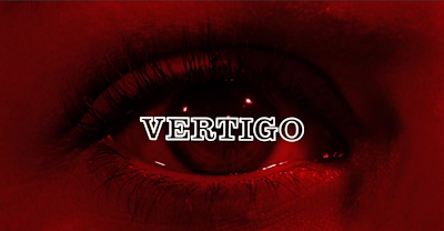
The film Vertigo uses one main font for the whole title. This involves a style where the characters are only made up of the outline with  the characters having no fill. This suggests that the initial and basic concepts of the film are fairly obvious, further backed up the use of a simple colour like white. Although, as you try to find a deeper meaning to them, it becomes unclear on what they are meant to symbolise. This overall, gives a sense of enigma top the film. The positioning of titles varies slightly for each title used. The main title for the however, lies directly in the centre the screen directly where the user will notice. Even more striking is that they are  directly over an eye, creating enigma and impact. One possibility for doing this could be to symbolise that the character who the eye belongs to is important to the story and holds deep significance. This would also go with the the placement of the other titles, featuring on areas of the person's face. The music that has been put to the titles sounds mysterious and matches with the enigma created by the images used in the titles. The overall feel of the title is a strong sense of enigma with a feeling that not everything is how it immediately seems.

Buried


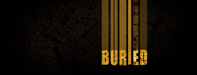
The titles of this film strongly hint towards a general underground theme for the film. The background if the titles are an earthy pattern which links directly to the title of the film. A downward pan has been used to accompany each title transition. This motion, along with a text blur to emphasise the movement, makes the viewer feel like their being dragged further and further down into the ground and at the same time, making the story seem confusing and mysterious. The confusion/fear created from these transitions immediately hooks the viewer into the story and makes them pay attention. The text colouring also mimics a ground theme. The colouring matches dry, cracked earth which is linked to desperation as well as linking back to the ground theme. The hard hard edged font also matches with the nature of this type of ground. Overall in this film's titles, an immediate connection has been made to the earth and links the name of the film directly into the narrative, making the viewer have some idea on what the film could be about yet not being able to be exact due to the lack of characters and extra information.


Film Title!

After a long time of making the film, we have finally got around to thinking about the title for our thriller opening. After much deliberation and conversation with our teacher, we have come up with the name....

Uncovered

Friday 16 March 2012

Refilming - Mark

Once we started editing, we realised that some of our shots from our first session of filming were either missing, or we felt could be improved in some way.

Here are some of our missing/flawed shots:
  • ELS of Attacker - Missing
  • Robert entering the interview room - Different background
  • DOF of Victim - Too long, too fast at points

Yesterday, we re-filmed the shots we needed to re-film. It went really well and the shots we got came out much better than the ones we had previously. They looked good on the computer when we looked at them today.


Below and above are some photos of myself and Megan filming the shots we needed at Sainsbury's. Also there is James who is acting.

Wednesday 14 March 2012

Evidence Board V1 & V2

This was version one of our evidence board. We decided that it was too neat & organised, so we decided to make another version.

This is the second version of our evidence board, where we have rearranged the pictures to add spontenaety. 

 This is the third and final version of our evidence board. We have incorporated many different things, and are pleased with how it has turned out.

Friday 9 March 2012

The Evidence Board - Megan

For the refiliming of certain scenes in our opening, we have chosen to have an Evidence Board on the wall situated behind the characters. We have deciced to create the evidence board together, basing ours on examples that we have found elsewhere.


This evidence board for example, is from the BBC series New Tricks. They have photos of suspects and people related in some way to the person they are investigating, as well as shots of where the death of their victim took place.

This is from the same evidence board in the same episode. A timeline from the last time the victim was seen also appears on the board.


This is a map of Brixton which we will crop and draw circles on to show areas of crimes in this area.


This is a photo of our attacker, which has been taken from a previous (minor) conviction. This will feature in our film to show the connection between the victim and the attacker. 

Evidence Photos - Edited - Chris


Thursday 8 March 2012

Refilming.

After viewing our initial cut of our film, we have decided to re-flim more than just the shot/reverse shots.


We have discussed with both our teachers the things that they think we could improve on if we were to re-film. For this reason, we have decided to film the following again:

  • the shot/reverse shot sequence - closer, less gap between characters 
  • the focus pulling shot at the start of the sequence - quicker
  • a section of dialogue between the victim and the attacker (e.g. "What do you want?")
  • close up of attacker's face - reflim room entry
  • possible two shot of attacker and victim
  • phone sequence (including a shot of him raising the phone to his ear.)
  • eyeline match with evidence board - photo of attacker
We also need to rethink our props, as we have one poster on the wall which seems to grab more attention than we originally intended it to. We are going to use an evidence board instead so that there is more to look at.

Rough Cut - Version 2

This is the second version of the rough cut


The main difference is that the shots during the shot/reverse shot sequence have all been zoomed in to help reduce the amount of space around the characters. Bringing them in to the viewer's attention more than the previous one.

Rough Cut - Version 1

Here is the first version of our rough cut

Wednesday 7 March 2012

Our Shot/Reverse Shot Sequence - Megan


Here are some examples of a shot/reverse shot sequence from the BBC drama Prisoner's Wives. The characters here are positioned in the centre of the frame, with the main focus being on the character themselves. The other character is in some cases barely visible, and in others quite prominent but not in focus. 


Our shot/reverse shots look like the first shot seen here:


We have tried to fix this by making the image larger in the screen. Although we can enlarge some of these shots to position the characters better in the frame, there is still a lot of white space surrounding our characters which you don't find in the sequences from Prisoner's wives. For this reason we have decided to refilm these shots so that we can position our characters better in the frame.

Thursday 1 March 2012

Editing Photos

Here are a few screenshots/photos that show us editing our opening.


This is a screenshot of a take board showing us what shot it is so we know what shot it is without having to look through it; inevitably it saves us time:

Megan hard at work editing and viewing our clips:


Editing - Progress - Mark & Megan

Mark - Today we managed to get all of the footage onto the Mac and all 57 clips converted, additionally Megan named all the clips . We then had time to open up final cut and put the clips in, and start piecing the first 4-5 clips into place, so far is looking good.

Filming Photos

Here are a few photos of us filming